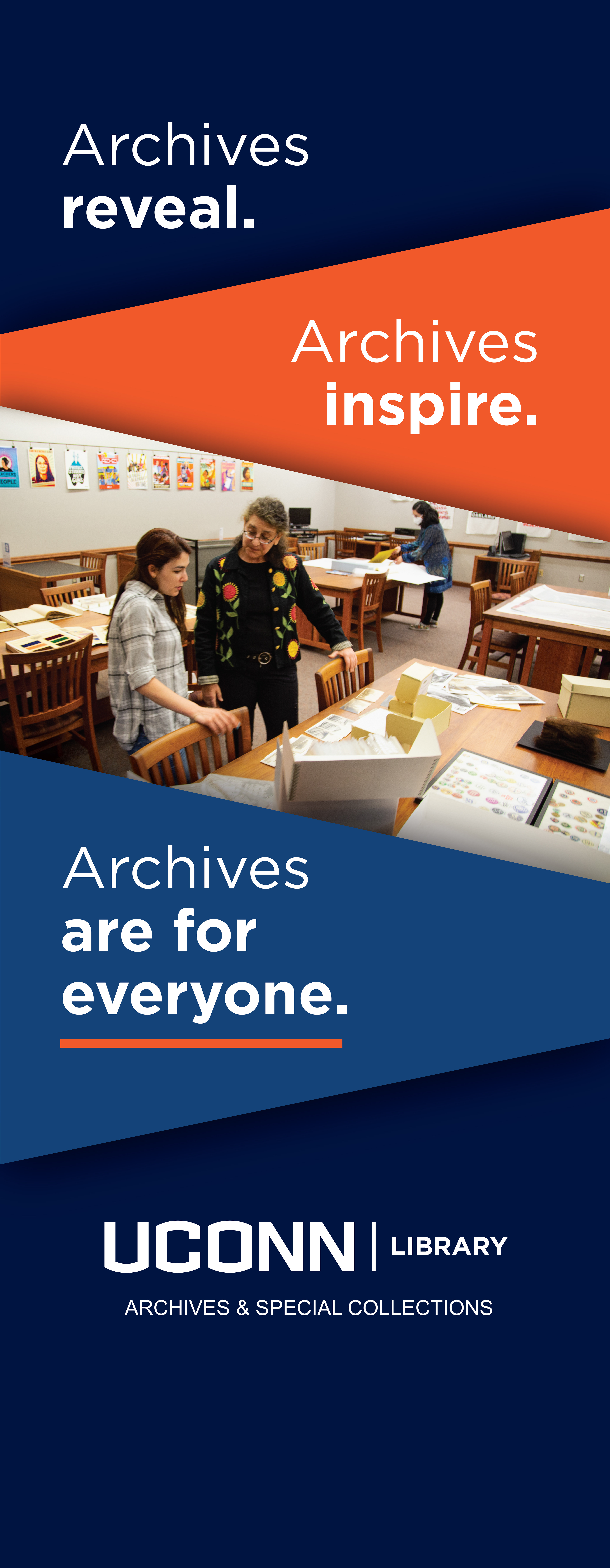
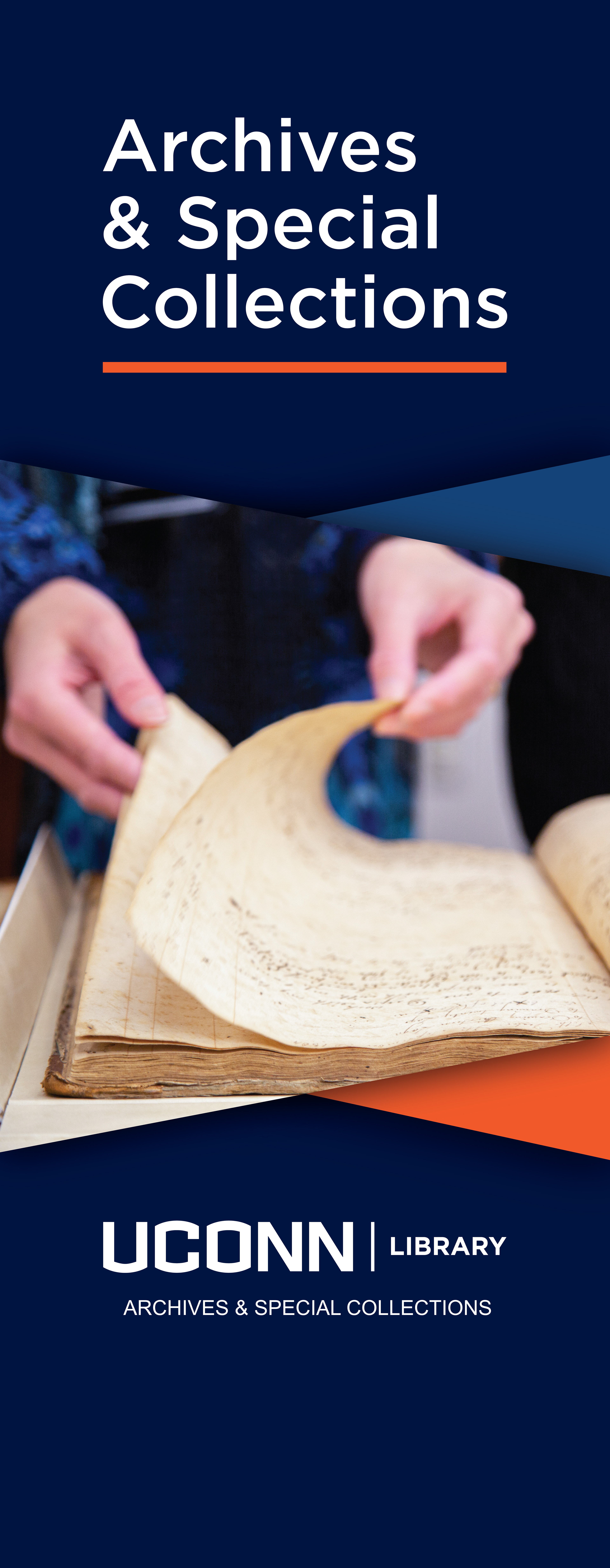
This project was to give the Archives & Special Collection spaces and branding a refresh while following established university brand guidelines. I used brand appropriate colors and fonts to create a text treatment for the words "Archives & Special Collections" that we used consistently for signage and digital marketing.
I provided direction for the creation of original photography for this project, and our staff looking at collection materials participated in the photoshoot. Photos included in the marketing materials and signs are by the very talented Library staff member, Brooke Foti Gemmell. The imagery and bold color blocking are carried throughout the campaign as well as the geometric forms.
I got buy-in at all levels of the library and archives for the work I was doing, and I guided student employees through the process of interpreting the banner sign designs into designs for digital marketing images, as well as print items like postcards. The signs welcome visitors to the reading room space, and are also used at outreach events. It aligns with the visual identity of the rack cards, web pages, and other Communication & Marketing unit projects.
I have received a good amount of positive feedback about this project, and it made my day when I heard that staff from the library at Yale were visiting and very much liked the signage.
